
One Floral Idea Two Color Directions
A simple studio exercise shows how the same floral motif can support a quiet mauve direction or a vivid blue one.
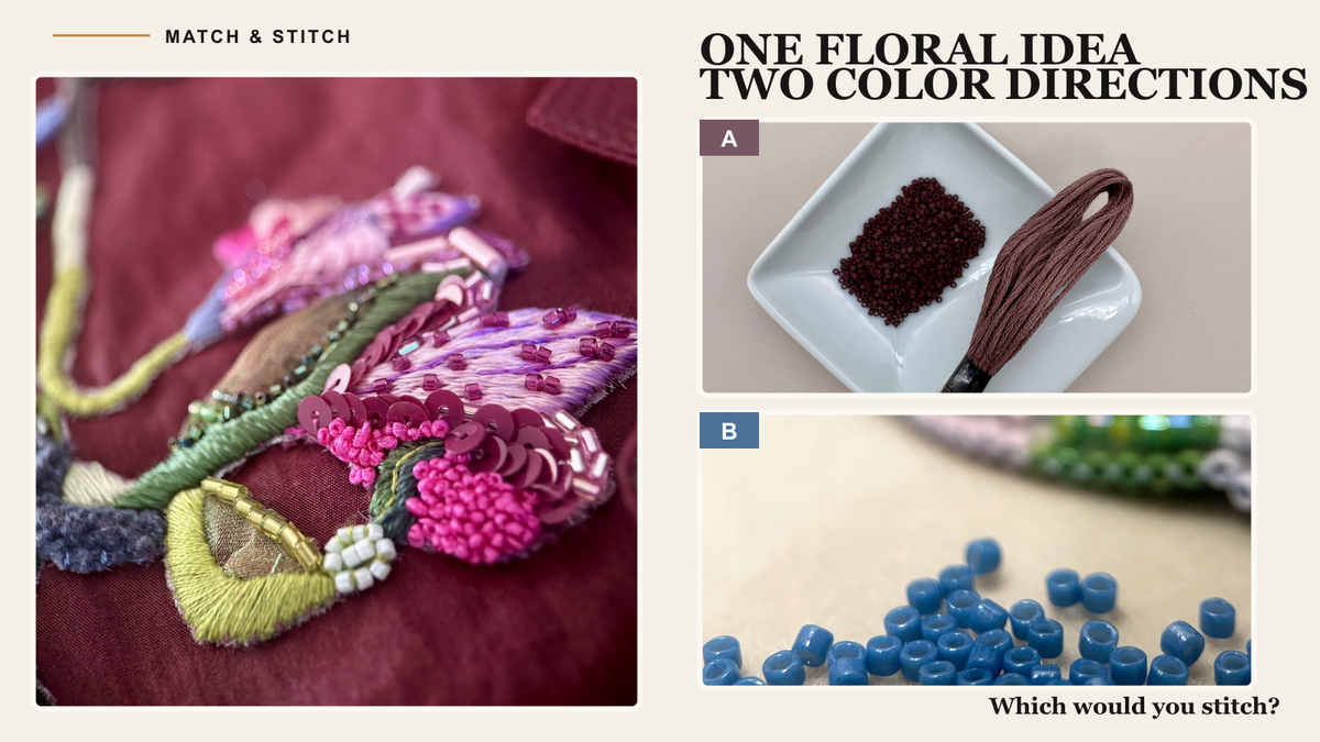
A floral motif can support more than one good color decision. The source may suggest a quiet, cohesive group of shades, while the maker may see an opportunity for a stronger accent. Both choices can work. They simply tell different stories.
For this studio exercise, we placed two real material directions alongside one embroidered floral motif. Direction A is muted and tonal, in mauve. Direction B uses vivid blue beads as a clearer point of contrast. The photographs are drawn from our own project archive. They are not presented as measured matches or as results produced by the Match & Stitch website.
Direction A: Quiet Mauve
The mauve direction remains close in value. The thread and beads fall within a narrow range, so the eye notices texture before contrast. This could suit a piece meant to feel soft, worn-in, or slightly vintage.
A tonal direction can also make material differences more important. A matte bead, a reflective bead, and a softly twisted thread may appear related in color yet behave very differently in light. A small physical sample usually tells you more than a larger arrangement on a screen.
Direction B: Vivid Blue
The blue direction changes the energy. Instead of extending the warm floral colors, it introduces a cooler accent that is more distant from the motif. The beads become a focal point rather than a quiet continuation.
This choice can be useful when the finished work needs a clearer rhythm or when one area should read quickly from farther away. It can also overwhelm a small motif if the bright material occupies too much space. Proportion matters as much as the color itself.
How To Choose Between Them
Begin with the job the piece needs to do. A framed embroidery viewed at home can tolerate a different level of subtlety than a brooch, a garment detail, or a stage piece. Consider where the work will be seen, how close the viewer will stand, and whether the material will move or catch light.
Next, place the materials on the actual ground fabric. Background color changes the relationship immediately. Check the arrangement in the light that matters for the finished piece, then make the smallest useful sample. A few stitches and beads are often enough to reveal whether a direction feels calm, muddy, lively, or distracting.
Finally, decide which difference is intentional. If the thread and beads are not identical, that may be useful. A deliberate shift in temperature, finish, or value can create depth. The problem begins when an accidental difference is presented as an exact match.
What A Color Tool Should Do
A color tool should make the search more focused and the comparison clearer. It can help a maker find plausible candidates, notice differences, and move from a broad idea to a practical shortlist.
It should not make the creative decision on the maker's behalf. The maker knows the fabric, finish, scale, lighting, and the feeling the project needs. The final decision belongs at the worktable, with the real materials in view.
Try The Exercise
Choose one motif from a current project. Develop one direction that stays close to its existing mood and another that deliberately shifts the contrast or temperature. Keep the options clearly distinct, then ask what each does for the finished work.
If you try it, share your choice with Match & Stitch on Instagram: A for the quieter direction or B for the bolder one, plus the detail that decided it.